nathan nankervis – nike alphabet
Design
Melbourne, VIC
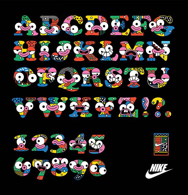
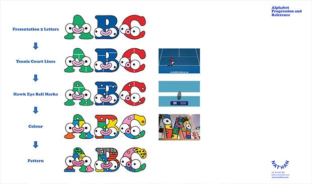
“Melbourne is the home of tennis. It's inspired by tennis – the energy, the passion, the style. And similarly, the game of tennis is energised by the city. This brief required me to create an alphabet that encapsulated Melbourne's love for the sport. I began by incorporating the lines of the tennis court within the letters, then adding the Australian Open's iconic 'hawk eye' ball marks. The finished work depicts the passion, energy and emotion of the players on the court, as well as the fans.”


